Visual Style
Warm, quiet, and operational. Cora's visual identity feels like a calm, competent colleague - never flashy, always ready to help.
Design Principles
Warm Space
Generous whitespace with warm, cream-toned backgrounds. Layouts breathe without feeling sparse.
Typography
Cal Sans for bold, confident headlines. Poppins for approachable body copy. Two fonts, no more.
Color
Burnt orange accents on warm cream backgrounds. Color is used sparingly to guide attention, never to decorate.
Illustrations
Flat geometrical shapes and organic plant elements in warm oranges and deep greens. Grounded, natural, artistic and unique.
Simplicity
Every element earns its place. No decorative flourishes, no gradients-for-the-sake-of-gradients.
Confidence
Quiet confidence, not loud claims. The brand feels premium and trustworthy without trying too hard.
Quick Reference
Do
- Use warm cream backgrounds (
#FFFBF7) - Use generous whitespace between sections
- Keep headlines bold and concise (Cal Sans)
- Use flat geometrical shapes and organic plant elements
- Let the burnt orange accent guide attention
- Maintain a calm, operational tone
Don't
- Use pure white (#FFF) as page backgrounds
- Use neon or saturated accent colors
- Add decorative gradients or patterns
- Use stock photography of people
- Make the brand feel "techy" or clinical
- Use more than two typefaces
Logo
The Cora logo combines the star-shaped mascot with the wordmark. The mascot features a friendly face with warm burnt-orange tones.

Name Usage
Always capitalize the first letter only.
Avoid all-caps, all-lowercase, or appending AI to Cora.
Logo Guidelines
Do
- Use the full logo (icon + wordmark) as default
- Ensure sufficient contrast against backgrounds
- Minimum width: 80px for full logo, 24px for icon
- Use the dark variant on dark backgrounds
Don't
- Rotate or skew the logo
- Change the logo colors
- Stretch or compress the logo
- Add effects (shadows, outlines, glows)
- Rearrange the icon and wordmark
Colors
A warm, earthy palette anchored by burnt orange. Every color reinforces Cora's approachable, operational personality.
#C0561F Hover states #D4622B Buttons, Headings... #F4A574 Borders, bullet points... #F2C8B2 Borders, Detail backgrounds #F9E8DF Backgrounds #FFFBF7 Body Backgrounds #3D2E1F Main text #6B5744 Secondary text #9A8574 Detail text #D1C7BD Disabled buttons #2C4563 Hover states #3A5A7D Buttons, icons #AFC0D2 Borders #E7EEF6 Backgrounds #35604C Hover states #3F6A55 Buttons, icons #BFD4C8 Borders #E6F0EB Backgrounds #732922 Hover states #983A30 Buttons, icons #D6B2AC Borders #F4E3E0 Backgrounds #A87010 Hover states #C48518 Buttons, icons #F0D2A6 Borders #FBF3E3 Backgrounds Typography
Two typefaces define Cora's voice: Cal Sans for confident headlines and Poppins for friendly, readable body text.
Headlines - Cal Sans
Body - Poppins
Tone of Voice
Cora speaks like a calm, competent colleague. Direct without being blunt. Warm without being cheesy. Professional without being stiff.
Voice Spectrum
"Hey! Your AI buddy is gonna totally crush those boring support tickets lol"
Too informal, uses slang. Undermines trust.
"An AI support agent that logs into your tools, checks accounts, and resolves tickets. Not another AI that deflects to humans."
Direct, confident, specific. Shows what Cora does without overselling.
"Our enterprise-grade artificial intelligence solution leverages state-of-the-art NLP to facilitate automated customer service resolution workflows."
Too corporate, uses jargon. Feels cold and impersonal.
Voice Principles
Warm
Talk like a helpful colleague, not a corporation. Use "you" and "your team." Be friendly without being casual. Cora should feel like someone you'd trust, not someone performing trust.
Grounded
Lead with specifics, not superlatives. "Resolves 70% of tickets" beats "revolutionizes your support." Real numbers, real actions, real outcomes. If you can't prove it, don't say it.
Quiet
Confidence through restraint. No exclamation marks, no hype words, no ALL CAPS. The product speaks - the copy just points. If a competitor would shout it, we'd say it plainly.
Writing Guidelines
Do
- Use active voice ("Cora resolves tickets" not "tickets are resolved")
- Lead with outcomes, not features
- Use specific numbers when available
- Keep sentences under 20 words when possible
- Address the reader directly ("your team", "you")
Don't
- Use buzzwords (synergy, leverage, disruption)
- Use ALL CAPS for emphasis
- Use exclamation marks in body copy
- Claim things that aren't provable
Imagery
Cora's illustrations use flat geometrical shapes and organic plant elements in warm oranges and deep greens. No stock photography. No corporate clipart. Every image should feel grounded, natural, artistic and unique.
Examples


Guidelines
Do
- Use warm, organic colors from our palette
- Keep compositions simple with one focal point
- Maintain consistent illustration style across pages
- In dark backgrounds, this brightness treatment: 85% brightness, 90% opacity
Don't
- Use stock photography of people
- Use flat/vector corporate clipart
- Use illustrations with hard edges or neon colors
- Use outlined shapes
- Use images that feel cold, clinical, or overly technical
Deck Template
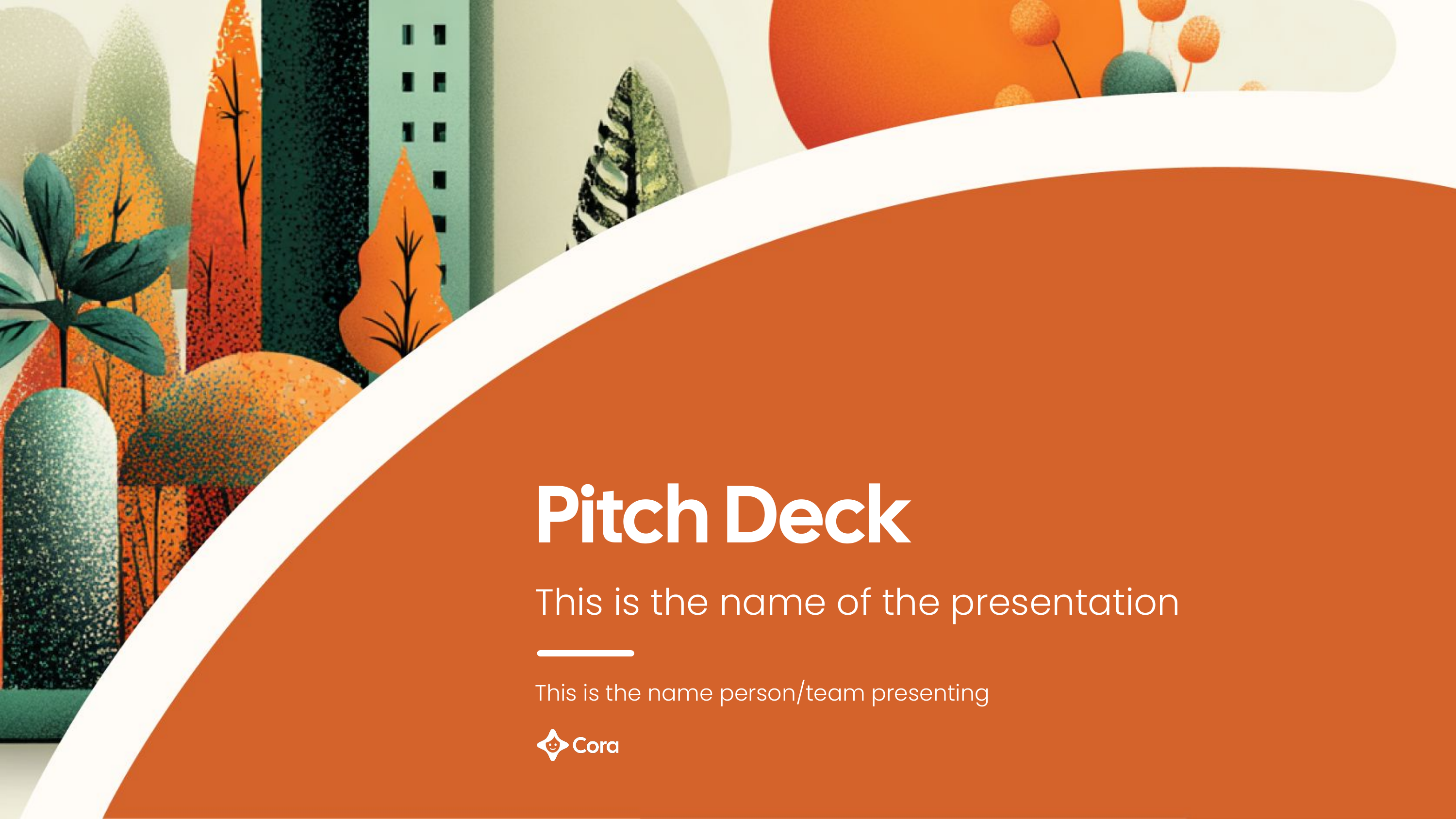
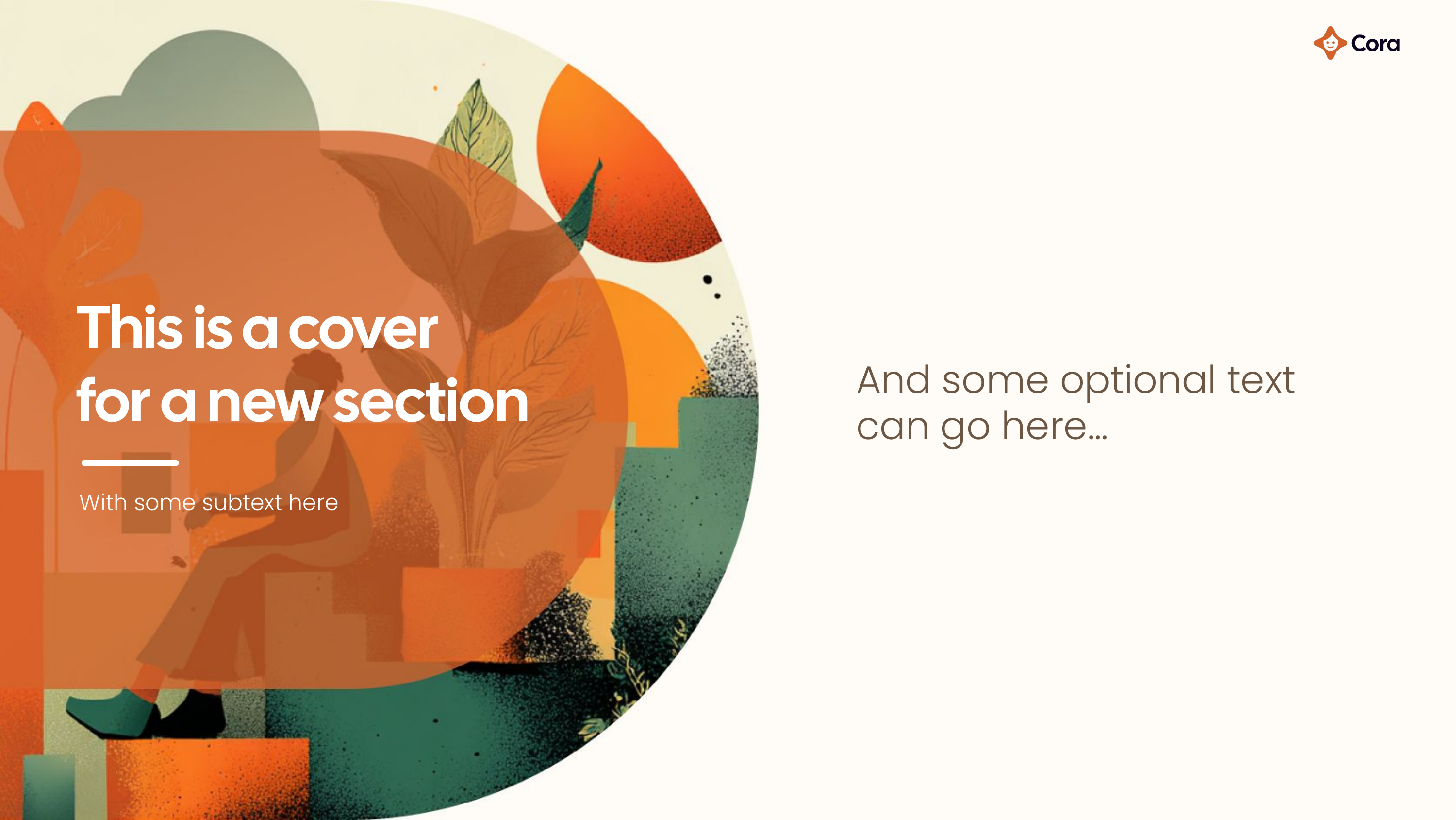
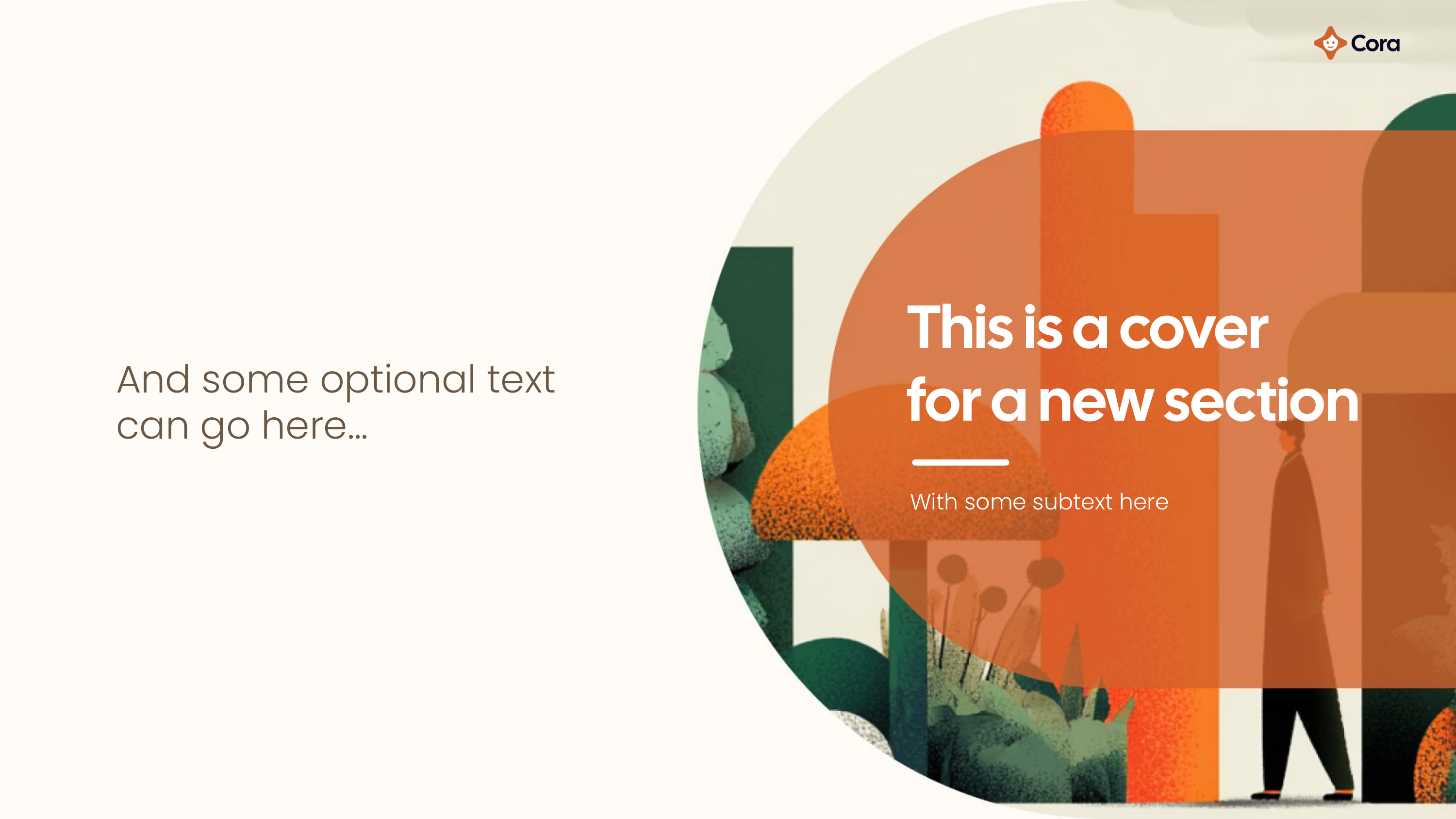
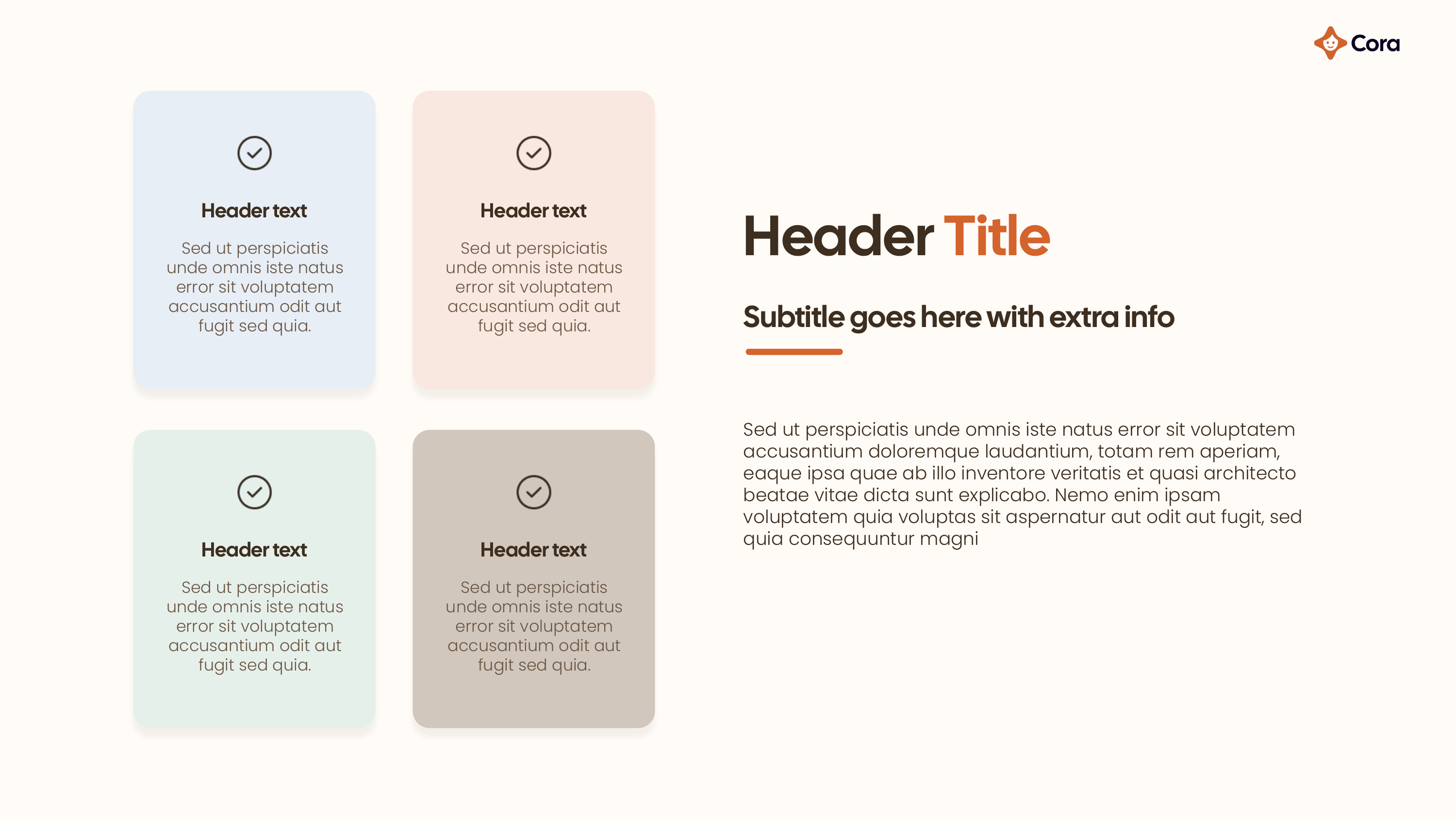
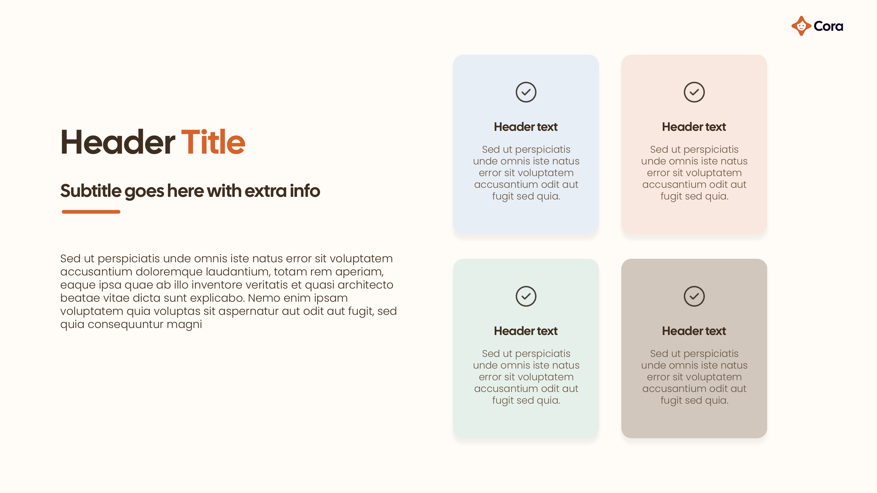
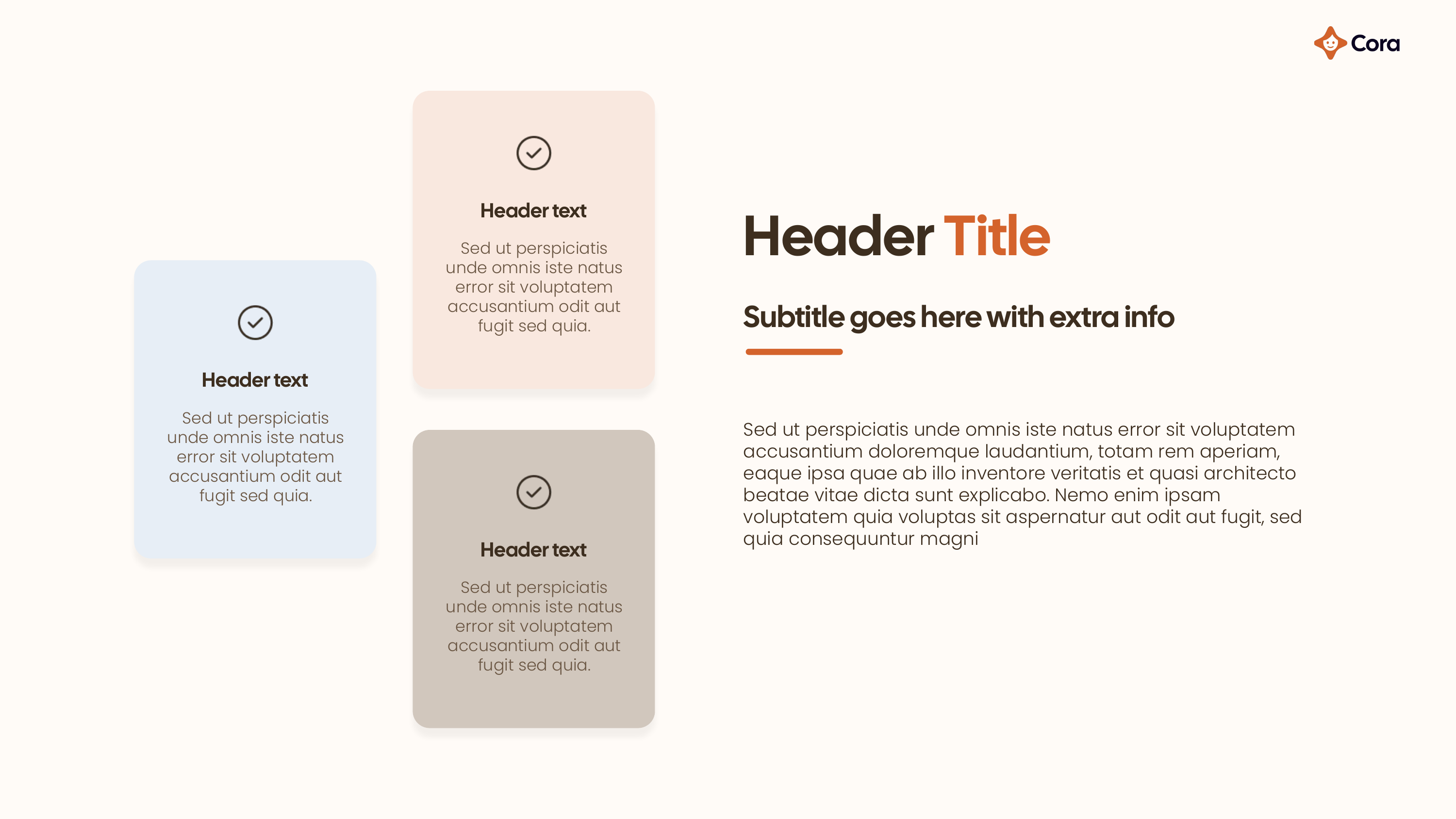
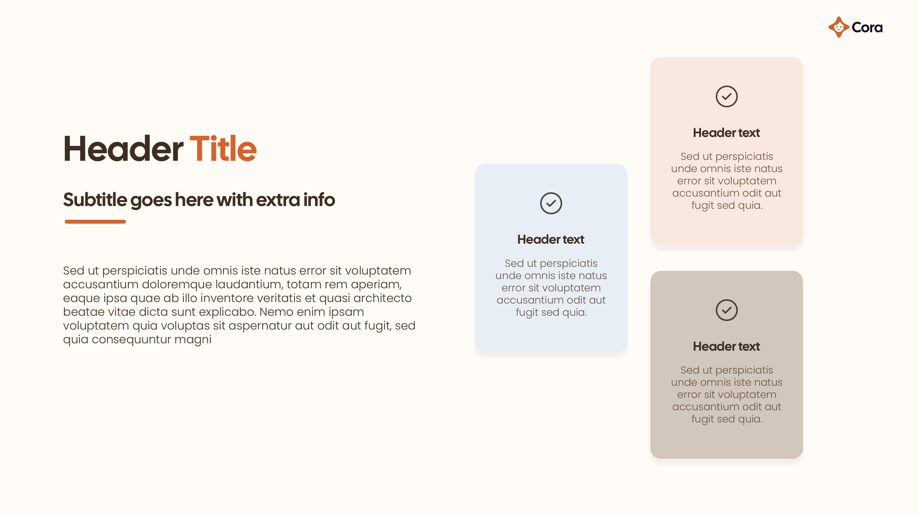
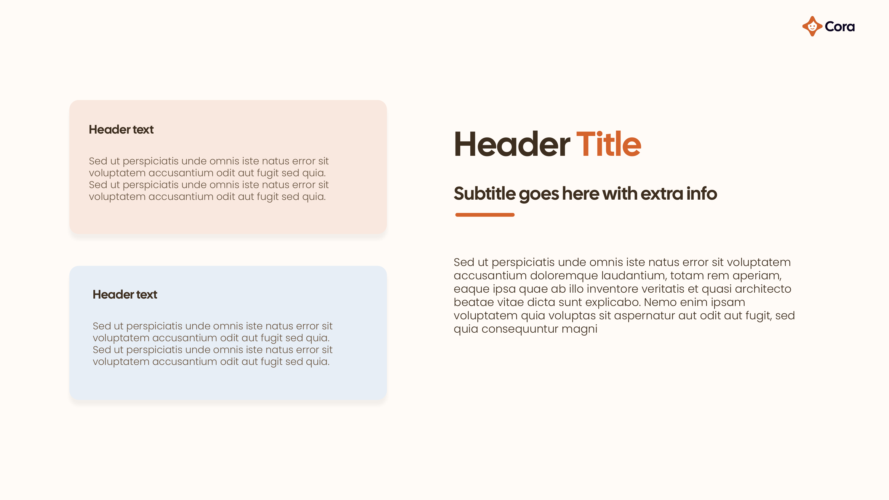
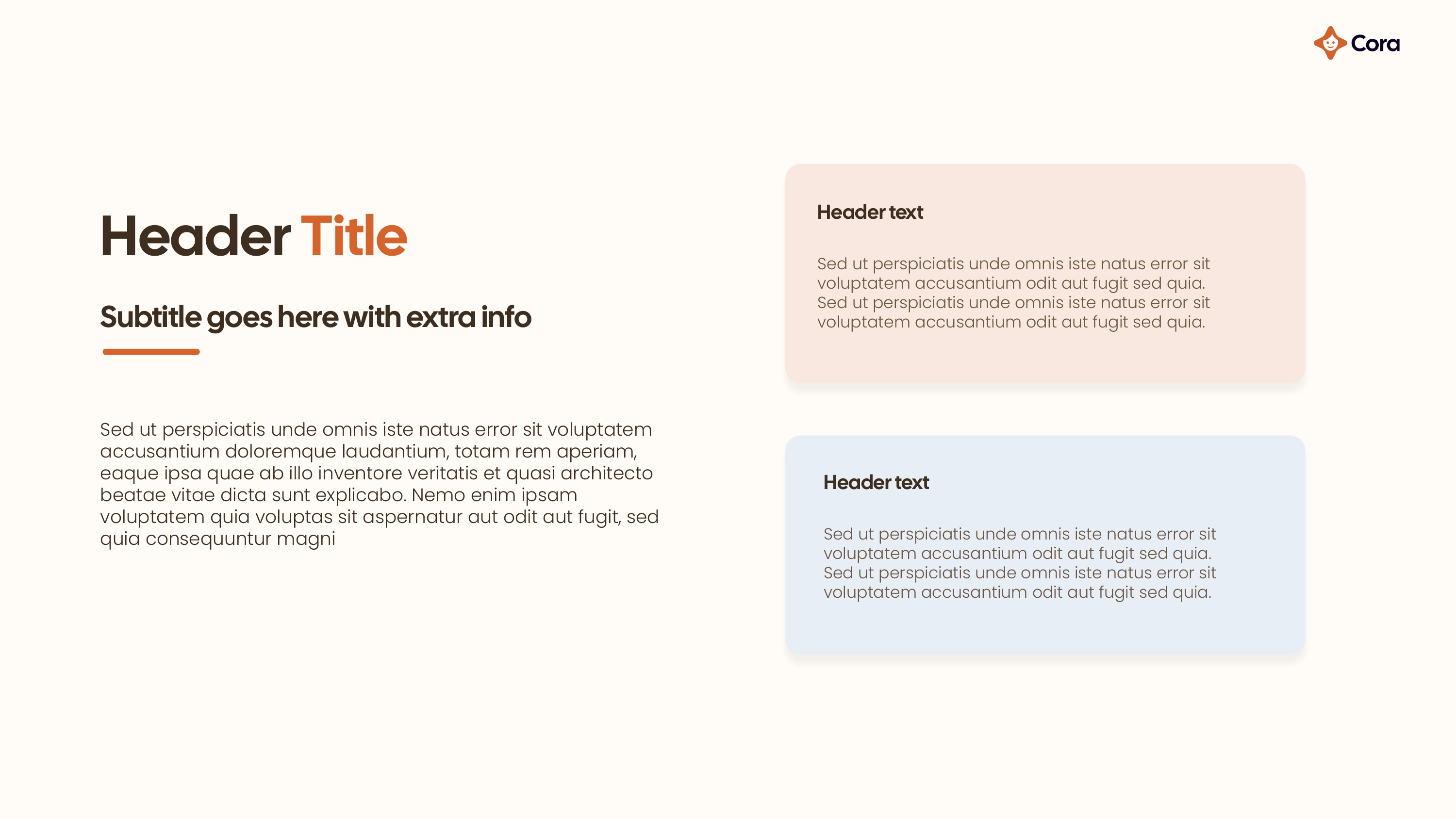
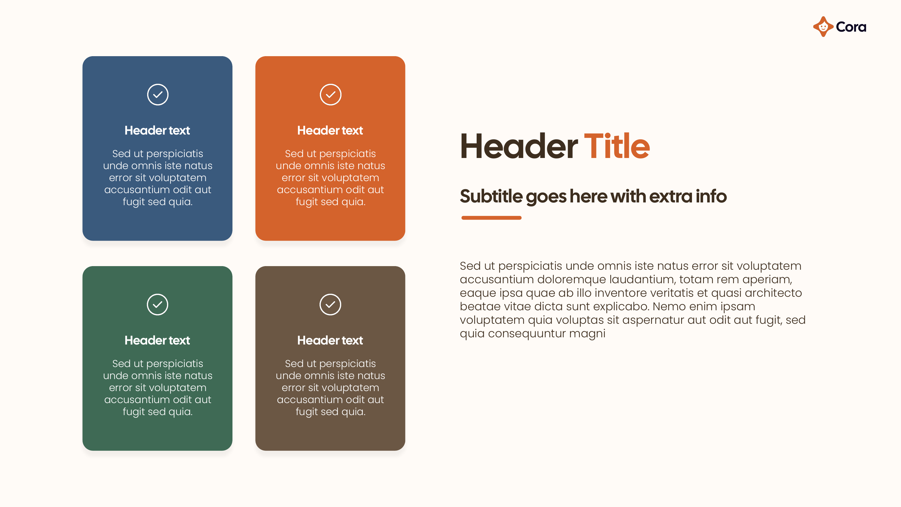
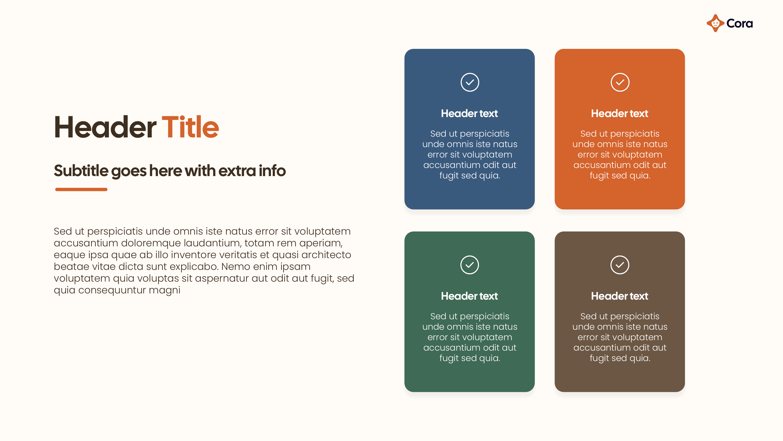
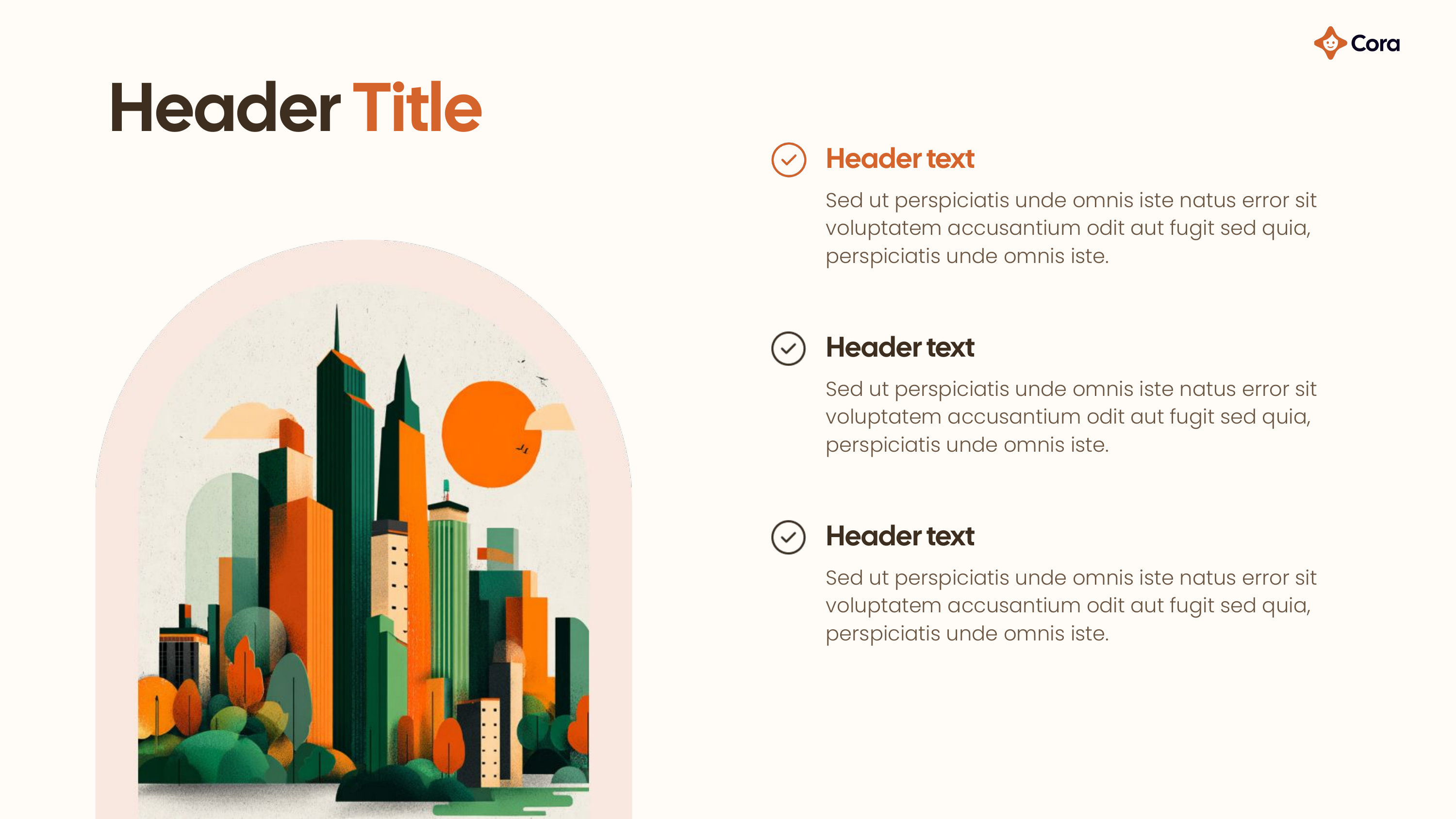
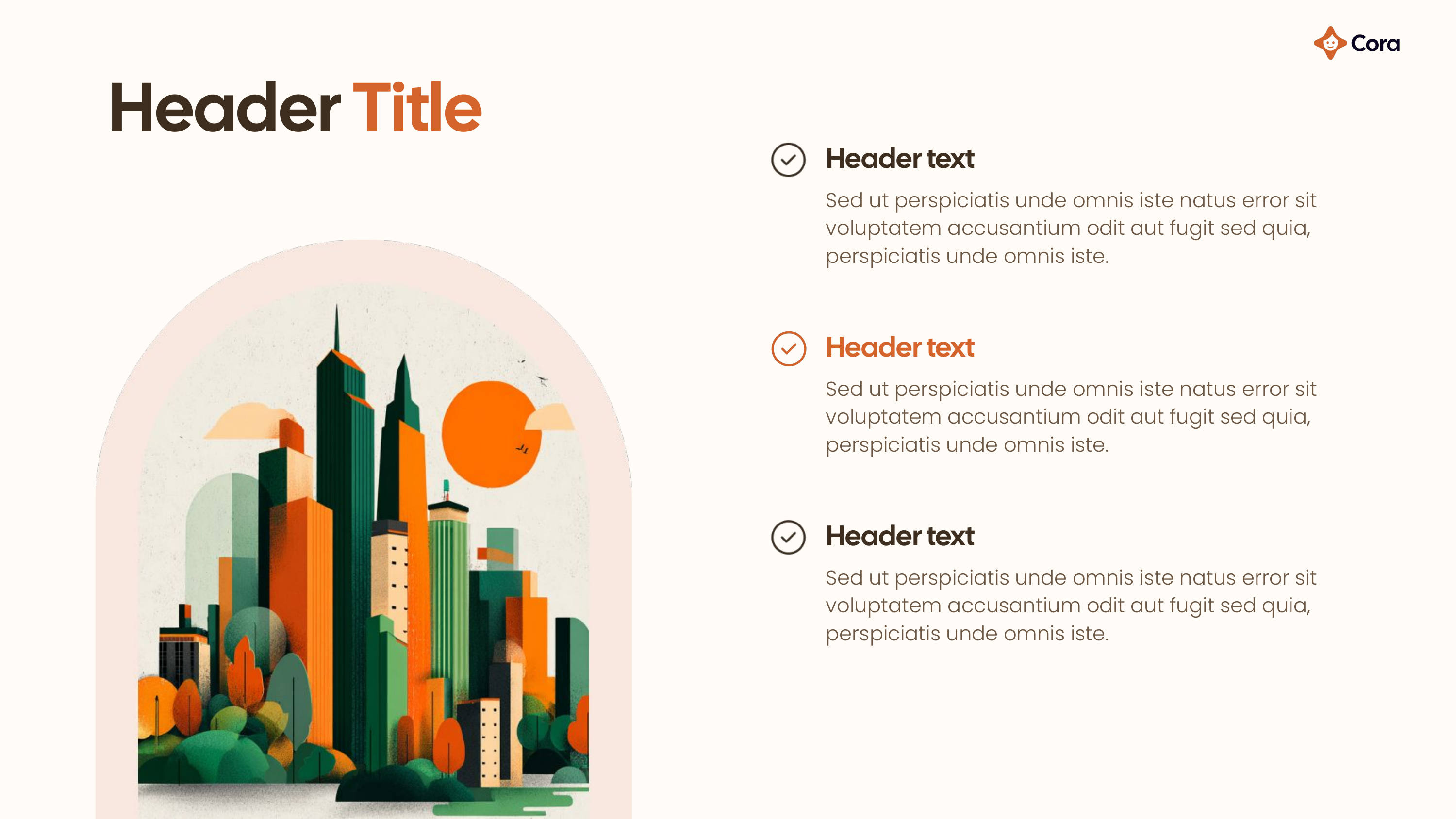
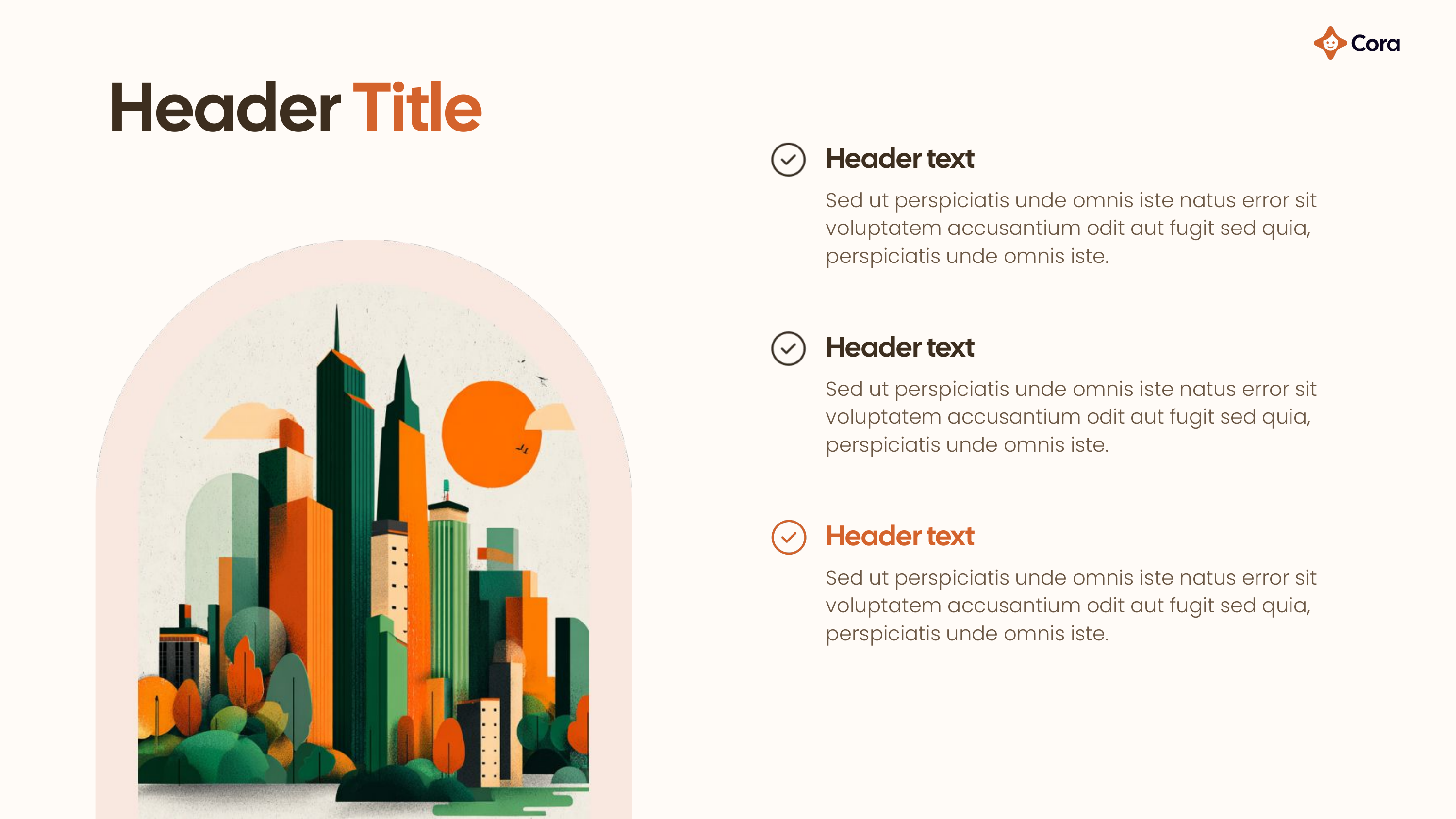
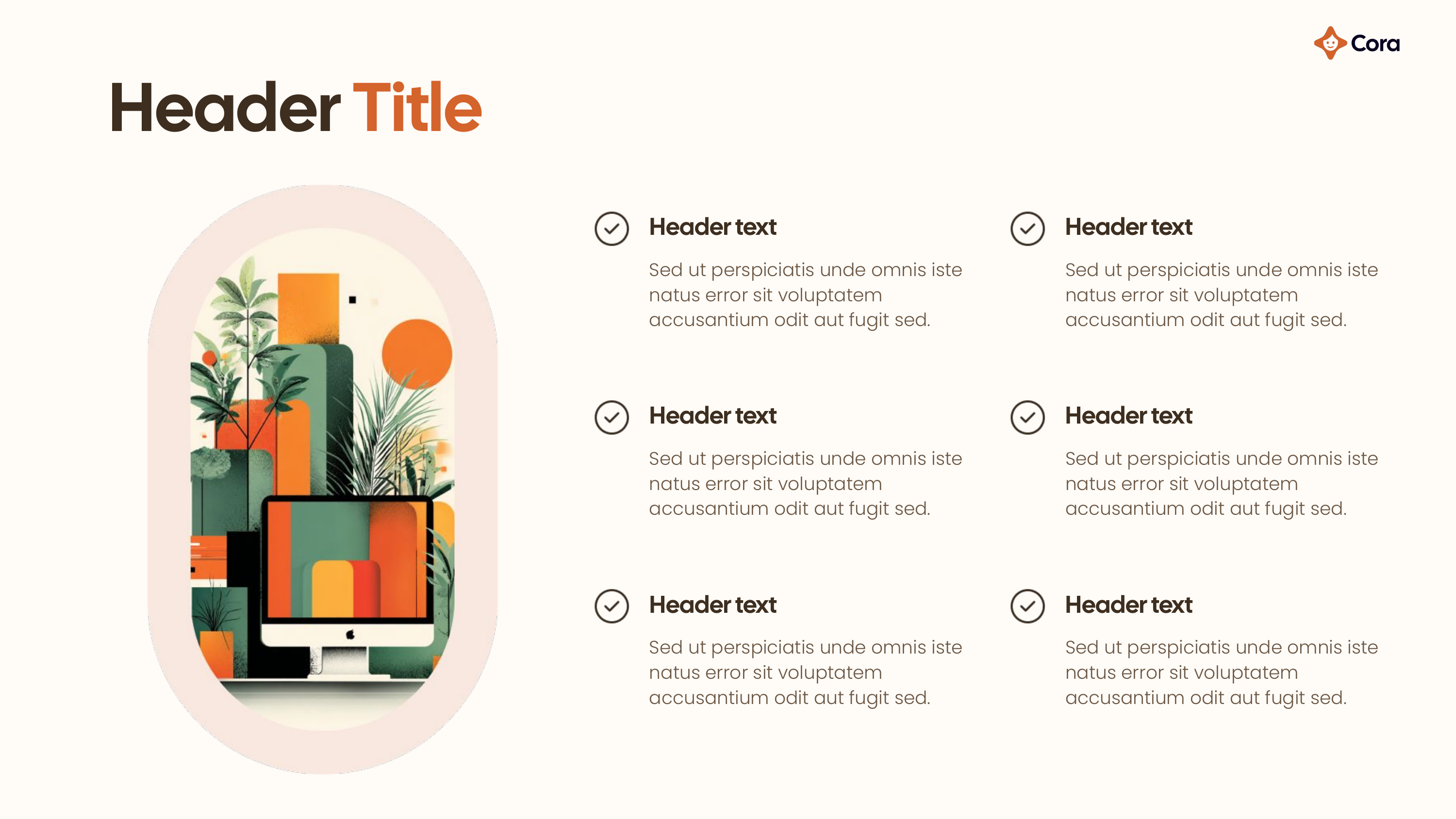
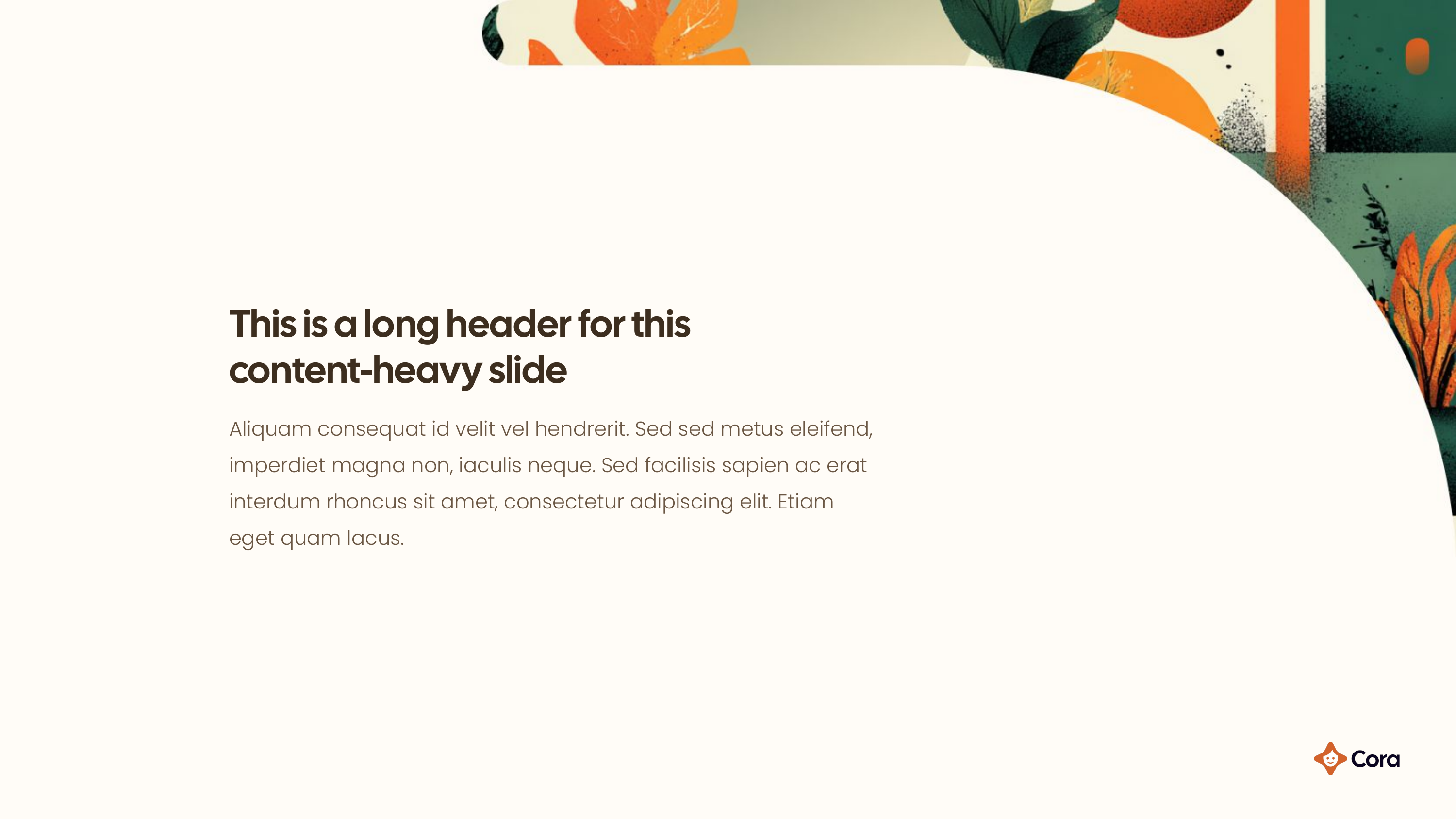
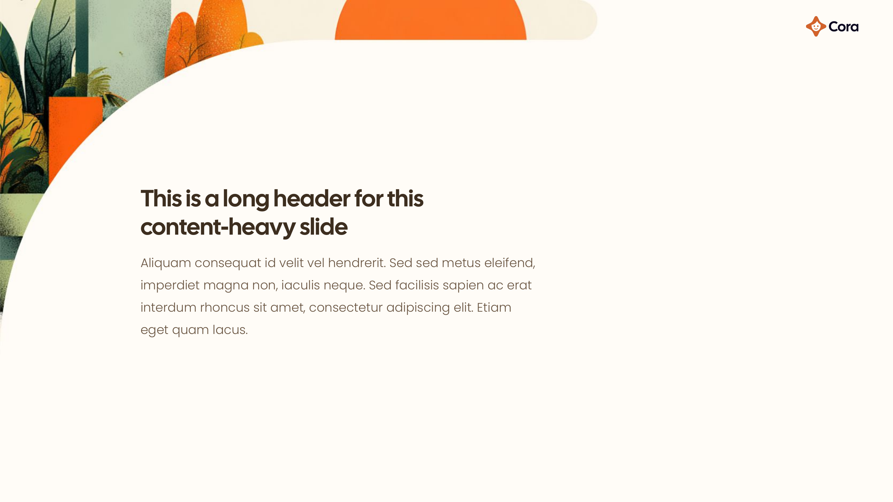
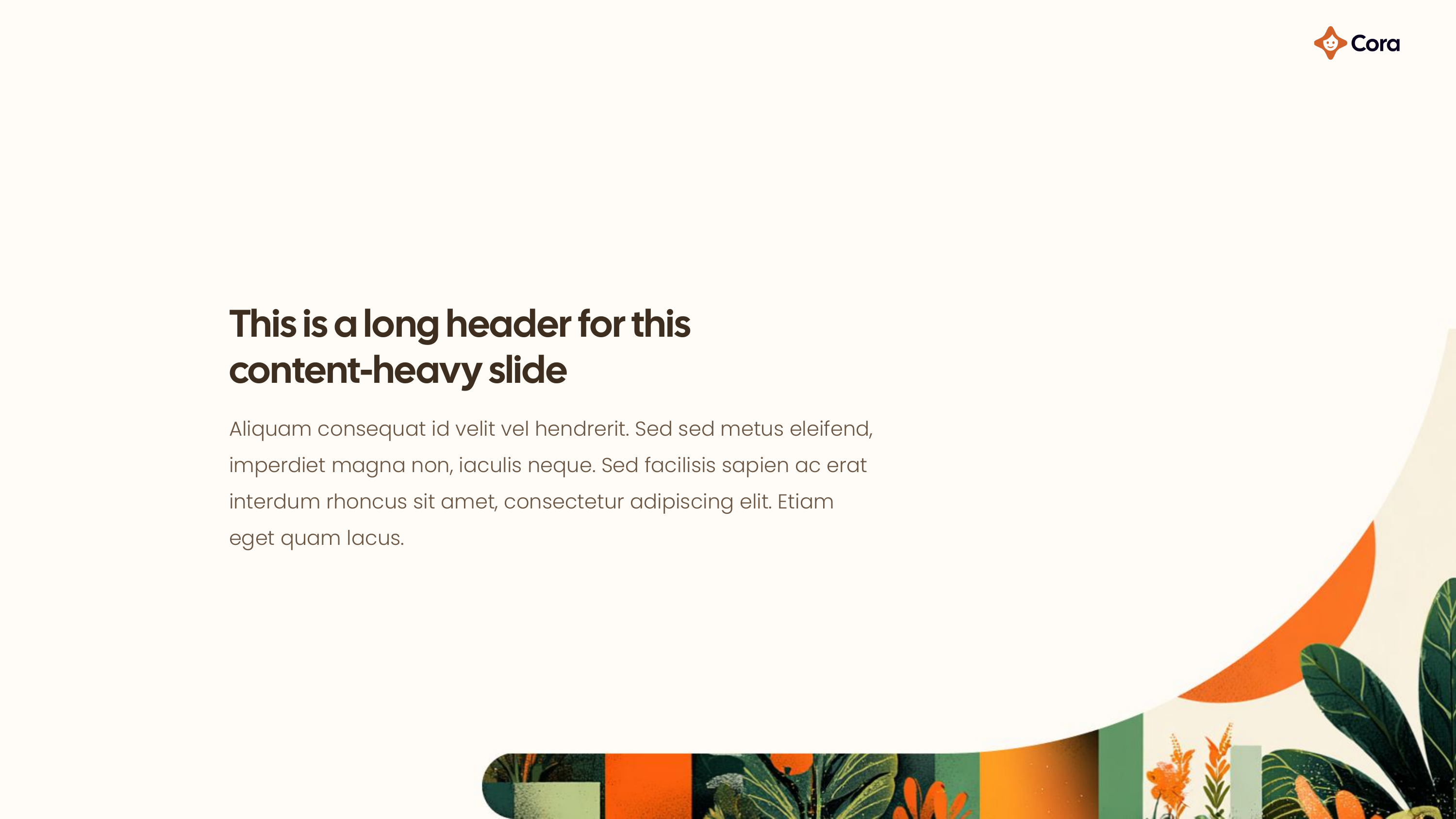
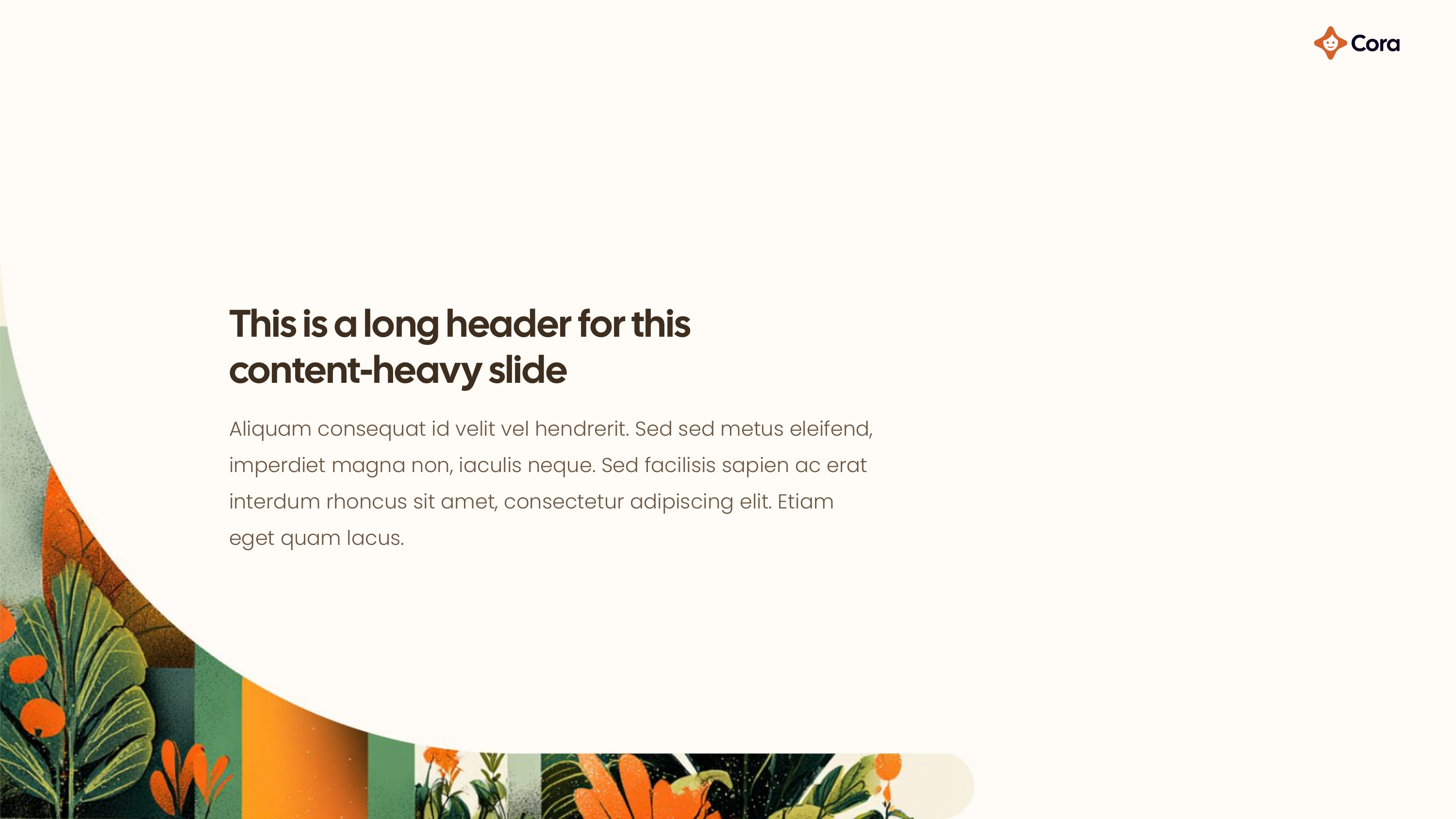
A ready-to-use presentation template that follows Cora's brand guidelines. Use it for pitch decks, internal presentations, and client-facing materials.